Websites & Conversion
Website Tune-Up vs. Full Redesign: What Local Businesses Need
A full website redesign isn’t always the answer. Discover the high-impact tune-up checklist that can lift conversions fast — without a costly rebuild.
·6 min read
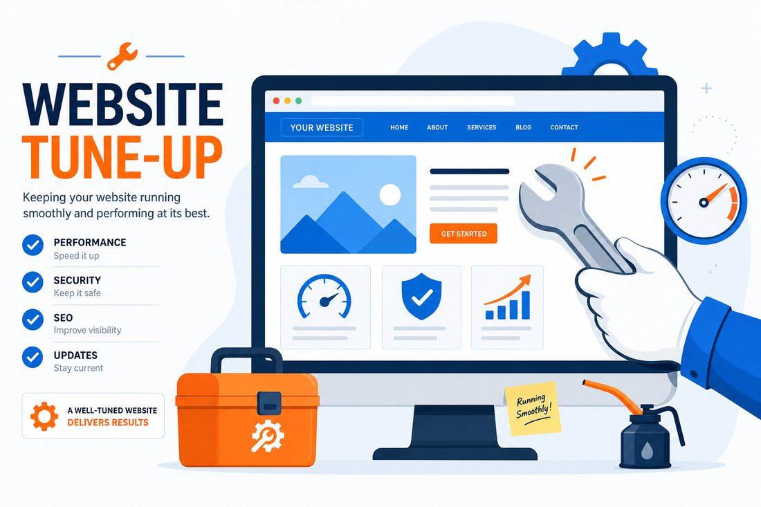
When leads slow down, the knee-jerk reaction is to rebuild the whole website.
New design. New platform. New everything. It feels productive. It feels like doing something. And sometimes — genuinely — it’s the right call.
But a lot of the time, you don’t need a new car. You need a tune-up.
Here’s how to tell the difference, and exactly what to fix first if a tune-up is what your site needs.
The Hidden Tax on Every Website Visitor
Every time something on your site creates confusion or friction — a vague headline, a slow load, a phone number that doesn’t tap-to-call — a small percentage of visitors decide not to reach out. They don’t announce it. They just leave.
That’s friction. And it’s a quiet, invisible tax on every person who finds you online.
The goal of a conversion tune-up is to find where that friction lives and remove it. Not repaint the whole house — just fix what’s actually broken.
The High-Impact Tune-Up Checklist
These are the changes that move the needle most, in order of impact. Work through this list honestly against your current site.
1. Clarify Your Headline and Service Area
Your homepage headline should do one thing immediately: tell a visitor what you do and where you do it.
“Trusted Tree Service in your area, FL — Call for a Free Estimate” is infinitely better than “Welcome to Our Website” or “We’re Here to Help.”
If someone has to read past the headline to figure out what you do, you’ve already lost some of them. Fix the headline first.
2. Add Proof Near Every CTA
Your call-to-action buttons are the moments of decision. Right next to those moments — not buried at the bottom of the page — should be proof that you’re the real deal.
That means: - A star rating and review count (“⭐ 4.9 stars — 87 Google reviews”) - A trust badge or years-in-business callout - A short quote from a real customer
Proof near the point of action reduces hesitation at exactly the moment people need reassurance. Move it close to your buttons, not away from them.
3. Make Your Phone Number Clickable and Visible
This sounds basic. You’d be surprised how often it’s broken.
On mobile, your phone number should be a tappable link — one touch, instant call. No copying a number and switching to the phone app. No hunting for it in a cluttered footer.
A sticky header or sticky call button at the bottom of the mobile screen, showing your phone number at all times, is one of the simplest improvements you can make and one of the most impactful for getting calls.
4. Compress Your Images for Speed
Large, uncompressed images are one of the most common reasons websites load slowly. And slow pages cost you leads — research cited by Shopify from Google data shows 53% of mobile visitors leave when a page takes longer than three seconds to load.
You don’t need to change your photos. You need to compress them. Free tools like Squoosh or TinyPNG can cut image file sizes by 70–80% with no visible quality loss. For a local service site, this is often the single biggest speed improvement available.
5. Shorten Your Contact Form
Every extra field you add to a contact form is a reason for someone to stop filling it out.
The high-converting form has three fields: name, phone or email, and a brief note about what they need. That’s it. Everything else — project details, budget, timeline — can be collected during the actual conversation.
Add a short promise just below the submit button: “We reply within one business day.” or “No spam. No pressure.” That one line of reassurance consistently increases the number of people who complete the form.
6. Repeat One Primary CTA Throughout the Page
Pick one action you want visitors to take. One. Then repeat it — same button text, same color — at the top of the page, mid-page, and in the footer.
If you’re currently using different button labels (“Contact Us,” “Learn More,” “Get Started,” “Request Info”) across different sections, you’re creating decision fatigue. Unify them. A homepage should feel like a clear path, not a multiple-choice test.
7. Add an FAQ Section
An FAQ section serves two purposes at once: it answers the objections that prevent people from calling, and it gives Google more relevant content to index and surface.
Answer the questions your real customers ask before they hire you. How much does it cost? What areas do you serve? How fast do you respond? What happens after I fill out the form? Each answered question is one less reason for a visitor to keep shopping around.
So When Is a Full Redesign the Right Call?
A tune-up works when the structure is basically sound and the problems are execution-level. A full redesign makes sense when:
- The platform is outdated and genuinely limiting (can’t be made mobile-friendly, can’t add pages easily)
- The branding is so misaligned with where the business is now that it’s actively hurting credibility
- The site was never properly built for conversion in the first place and the content architecture needs to be rethought from scratch
Even then, the best redesigns are built around the same conversion principles the tune-up fixes. The foundation doesn’t change — clarity, proof, speed, and a single obvious next step.
Quick Takeaways
- Friction is a hidden tax on every visitor — find it and remove it
- Fix the headline and service area first — this has immediate impact
- Move proof (reviews, ratings) close to your CTA buttons
- Make your phone number tap-to-call on mobile
- Compress images to improve load speed
- Shorten your form to three fields; add a reassurance line below it
- Use one consistent CTA repeated throughout the page
- Add an FAQ to handle objections and boost SEO
FAQ
How do I know if my website needs a tune-up or a full redesign?
Start by testing it with a few honest eyes. Ask someone unfamiliar with your business to pull it up on their phone and spend ten seconds on the homepage. Can they tell you what you do, where you do it, and what to do next? If not, you likely have a clarity and structure problem — which a tune-up can fix. If the platform itself is broken or the site is fundamentally unusable, that points toward a rebuild.
How long does a website tune-up take?
Most of these fixes — headline rewrites, form simplification, image compression, CTA unification — can be done in a few hours with the right access to the site. An FAQ section takes a bit longer to write well. In most cases, a meaningful tune-up can be completed in a day or two.
Will a tune-up improve my Google ranking?
Indirectly, yes. Faster load times, clearer content, and better mobile usability all send positive signals to search engines. The FAQ section adds keyword-relevant content. None of this replaces a dedicated SEO strategy, but a better-performing site generally improves over time in search as well.
What if I fix these things and leads still don’t improve?
Then it’s time for a deeper look — at your traffic sources, your local SEO, your Google Business Profile, and whether enough people are actually finding your site in the first place. But conversion fixes should always come before traffic-building. There’s no point driving more visitors to a site that doesn’t convert them.
Let’s Take an Honest Look at Your Site
At Medic 1 Media, we don’t automatically recommend rebuilds. We start with an honest audit — looking at what’s working, what’s creating friction, and whether the fix is a tune-up or something more. If you’re a local or your county service business wondering why your site isn’t generating the calls it should, request a free audit. We’ll give you a clear answer and a real plan — no pressure, no upsells, just useful advice.
Get My Free Growth Audit