Websites & Conversion
The 3-Click Rule: How Local Business Websites Lose Leads
If visitors can’t reach what they need in 3 clicks, your site structure is working against you. Here’s how to fix it for your local business.
·6 min read
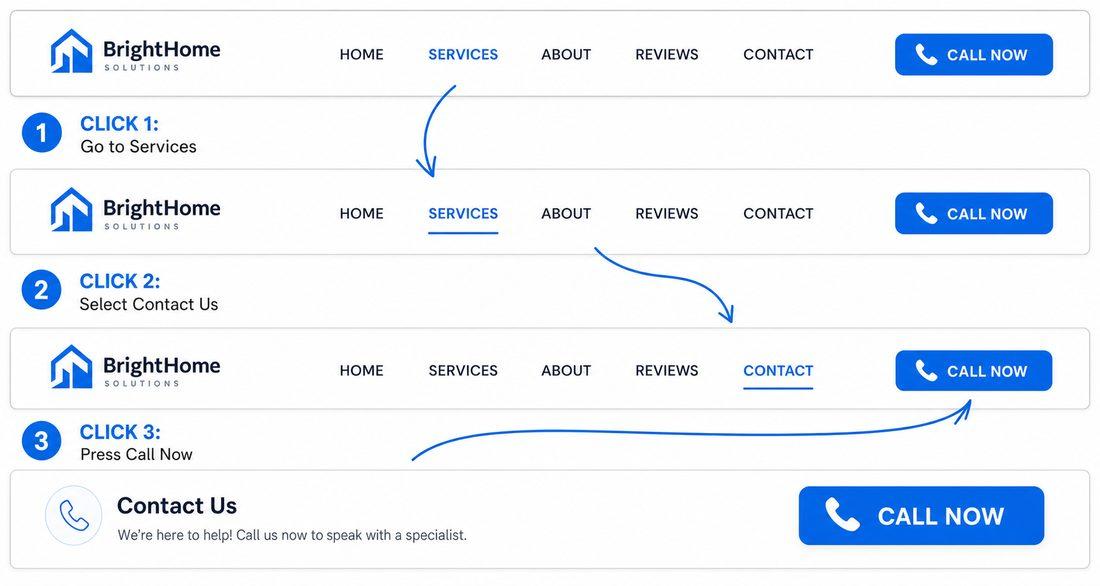
There’s a simple rule that separates websites that convert from websites that confuse.
It’s called the three-click rule. And it’s not a technicality — it’s the way human attention actually works when someone lands on your site ready to take action.
If a visitor can reach their goal in three clicks or fewer, you’re working with their momentum. If it takes longer, you’re working against it. And working against it means lost leads — not because people are impatient, but because friction accumulates.
What the Three-Click Rule Actually Means
The idea is straightforward: from any page on your website, a visitor should be able to reach the action they want — a call, a quote, a contact form, a specific service — in three clicks or less.
Not five. Not seven. Three.
Think about the most common paths your customers take when they find your site:
- They want to call you directly
- They want to understand what a specific service includes
- They want to read your reviews before reaching out
- They want to check your pricing or get a quote
For each of those paths, count the clicks from your homepage. If you’re consistently landing at four, five, or more, you have a structure problem — and it’s quietly costing you every day.
The Three Paths That Matter Most
Path 1: Home → Service → Call or Quote
This is the most common journey for someone who’s ready to hire. They want to confirm you do what they need, see that you serve their area, and then contact you — ideally without having to navigate anywhere else.
If your services are buried in a dropdown, or if the individual service pages don’t have a clear, prominent CTA, this path breaks. Fix it by making each service page self-contained: what you do, who it’s for, why you’re the right choice, and a direct way to get in touch — right there on the page.
Path 2: Home → Reviews → Contact
Many customers want social proof before they commit. They land on your homepage, think “let me see if other people like them,” and go looking for reviews.
If your reviews are easy to find — a dedicated page, a prominent section on the homepage, or a visible link in navigation — they read them, feel confident, and click to contact. If reviews are hidden or scattered, they either leave to check Google or lose momentum along the way.
Path 3: Home → Pricing or FAQ → Call
Price-conscious customers (most of them) want to at least see a ballpark before they reach out. Same with people who have specific questions about how you work.
A clearly accessible FAQ page or a pricing section on your service pages shortens this path to three steps. Without it, visitors are left guessing — and guessing often leads to leaving.
What Breaks the Three-Click Rule
Most local business websites don’t fail because of bad design. They fail because of accumulated complexity. Here’s what typically adds extra clicks:
Overloaded navigation. A menu with ten or twelve items forces people to work to find what matters. Aim for five to seven navigation items, focused on what customers actually look for — not every internal page you’ve ever built.
No CTA inside service sections. If someone reads your landscaping page and there’s no button to request a quote right there — only in the footer or header — you’ve added a click and a pause. Put a CTA inside every service description.
Top services buried below the fold. Visitors shouldn’t have to scroll significantly before seeing what you offer. Your core services should appear on the homepage, above or near the fold, with links that take customers directly to the relevant page.
Internal links that go nowhere useful. Links within your content should guide decisions, not just send people to more reading. If you link from a service page, link toward a CTA or a related service — not deeper into informational content with no natural exit toward contact.
The Well-Lit Hallway vs. the Scavenger Hunt
Here’s a useful way to think about website navigation: your site should feel like a well-lit hallway, not a scavenger hunt.
In a well-lit hallway, every door is visible and labeled. You know where each one leads. You can get from the entrance to your destination without backtracking, guessing, or asking for help.
A scavenger hunt, on the other hand, makes you work. You have to look for clues, check multiple paths, and hope you eventually end up somewhere useful. It’s tiring. Most people don’t finish it.
The difference between these two experiences, on a website, is often just a handful of structural decisions: how navigation is organized, where CTAs are placed, and whether internal links guide people forward.
How to Audit Your Own Site in Ten Minutes
Run this quick test today:
- Open your website on your phone (mobile traffic is the majority for most local service businesses)
- Pretend you’re a new visitor who wants to get a quote for your main service
- Count the taps it takes to reach a phone number or contact form from the homepage
- Then try the same test for: finding your reviews, finding your service area, and understanding your pricing or process
If any of these paths hit four clicks or more, you’ve found a friction point worth fixing.
Quick Takeaways
- Visitors should reach their goal in three clicks or fewer from any page
- Map the three most common paths: service → contact, reviews → contact, FAQ/pricing → contact
- Keep navigation to five to seven focused items
- Place a CTA button inside every service section, not just in the header and footer
- Put your top services on the homepage with direct links
- Make internal links guide decisions, not just create reading paths
- Test this yourself on your phone — that’s how most of your customers see it
FAQ
Is the three-click rule an official SEO standard?
It’s not a formal ranking factor, but it’s a widely recognized UX principle. The logic is simple: the more steps between a visitor and their goal, the more chances for drop-off. Reducing friction improves conversions — and a site that converts well tends to perform better in search over time as user behavior signals improve.
What’s the right number of navigation items for a local service website?
Most local service businesses do well with five to seven. The goal is clarity, not comprehensiveness. Include: Home, Services (or individual service pages if you have only a few), About, Reviews or Testimonials, and Contact. Everything else is a judgment call based on what your customers actually look for.
What if I have a lot of services — do I need a page for each one?
If you offer ten services and list them all on one page, that’s actually an opportunity — you can break each into its own dedicated page with a specific headline, its own FAQ, and its own CTA. This helps both with navigation clarity and with SEO (Google rewards specificity). [Internal link suggestion: link to article about individual service pages]
How do I know which paths are most important to optimize first?
Look at your Google Analytics (or whatever analytics tool you use) to see which pages get the most traffic and where people exit without converting. If a page gets a lot of visits but very few form fills or calls, it’s a strong candidate for a three-click path audit. If you don’t have analytics set up, that’s worth fixing first.
Let’s Map the Path Your Visitors Are Actually Taking
Sometimes you’re too close to your own site to see where the friction is. That’s completely normal — you built it knowing where everything is. At Medic 1 Media, we look at your site the way a first-time visitor would. We map the paths, find where clicks pile up, and give you a clear set of structural fixes that move people toward contact faster. Request a free website audit and we’ll walk you through exactly where your site is adding steps it shouldn’t — and how to clean it up. No cost, no pressure. Just a clear picture of what’s happening and what to do about it.
Get My Free Growth Audit