Websites & Conversion
One CTA Can Raise Conversions Overnight — Local Business Tips
Too many calls to action on your local business website confuse visitors into doing nothing. Here’s how one focused CTA can dramatically boost leads.
·5 min read
What if one change to your website — something you could technically implement this afternoon — had a meaningful impact on how many people actually call you?
It sounds too simple. But one of the most common and costly mistakes on local business websites is also one of the easiest to fix: having too many calls to action.
Here’s the counterintuitive truth. More options don’t create more action. They create hesitation — and hesitation kills conversions.
When Five Buttons Mean Zero Calls
Picture this. A potential customer in your area lands on your website. They scroll through your homepage and see:
- “Contact Us”
- “Learn More”
- “Get Started”
- “Request Info”
- “Schedule a Consultation”
- “Book Now”
Which one do they click?
If you said “none of them,” you understand the problem. Psychologists call it decision fatigue — when faced with too many choices, people’s default response is to make no choice at all. On a website, that means they close the tab and move on to a competitor who made the decision easier.
Every extra button you add to a page isn’t giving visitors more options. It’s adding friction. And friction is the enemy of the phone ringing.
The Principle Behind the Fix
The great copywriters and direct-response advertisers built their careers on the idea of making it as simple as possible for someone to take the next step. Claude Hopkins, one of the foundational figures in advertising, understood that reducing the “cost of response” — whether that’s effort, confusion, or perceived risk — is one of the most reliable ways to increase action.
That idea applies perfectly to your website’s calls to action. The goal isn’t to give visitors every possible option. The goal is to make one option so obvious, so frictionless, and so clearly the right next step that they don’t have to think about it.
One action. Said clearly. Repeated consistently. That’s the runway.
How to Pick Your One Primary CTA
Start by asking yourself: what is the single most valuable thing a visitor can do on this website?
For most local service businesses in your area, the answer is one of these:
- Get a Fast Quote — ideal for project-based services (landscaping, roofing, painting)
- Call Now — works for any service where speed matters
- Schedule a Free Consult — great for higher-ticket or relationship-based services
- Check Availability — useful for businesses with limited capacity or scheduling
Choose the one that best fits your business. Then commit to it completely.
The Rule: One Phrase, Everywhere
Once you’ve chosen your primary CTA, use the exact same wording every time it appears. Not variations — the same phrase.
Why does this matter? Because repetition creates familiarity. By the time a visitor reaches the bottom of your homepage, they’ve already seen your CTA two or three times. It starts to feel natural. Expected. The obvious next move.
When you mix and match wording — “Call Now” here, “Get a Free Quote” there, “Book Online” somewhere else — each instance feels like a separate decision. That adds friction right at the moment you’re trying to remove it.
Same phrase. Every button. Every time.
Where Your CTA Buttons Need to Live
Choosing one CTA and one phrase is only half the job. Placement matters just as much.
Put your primary CTA button in these locations:
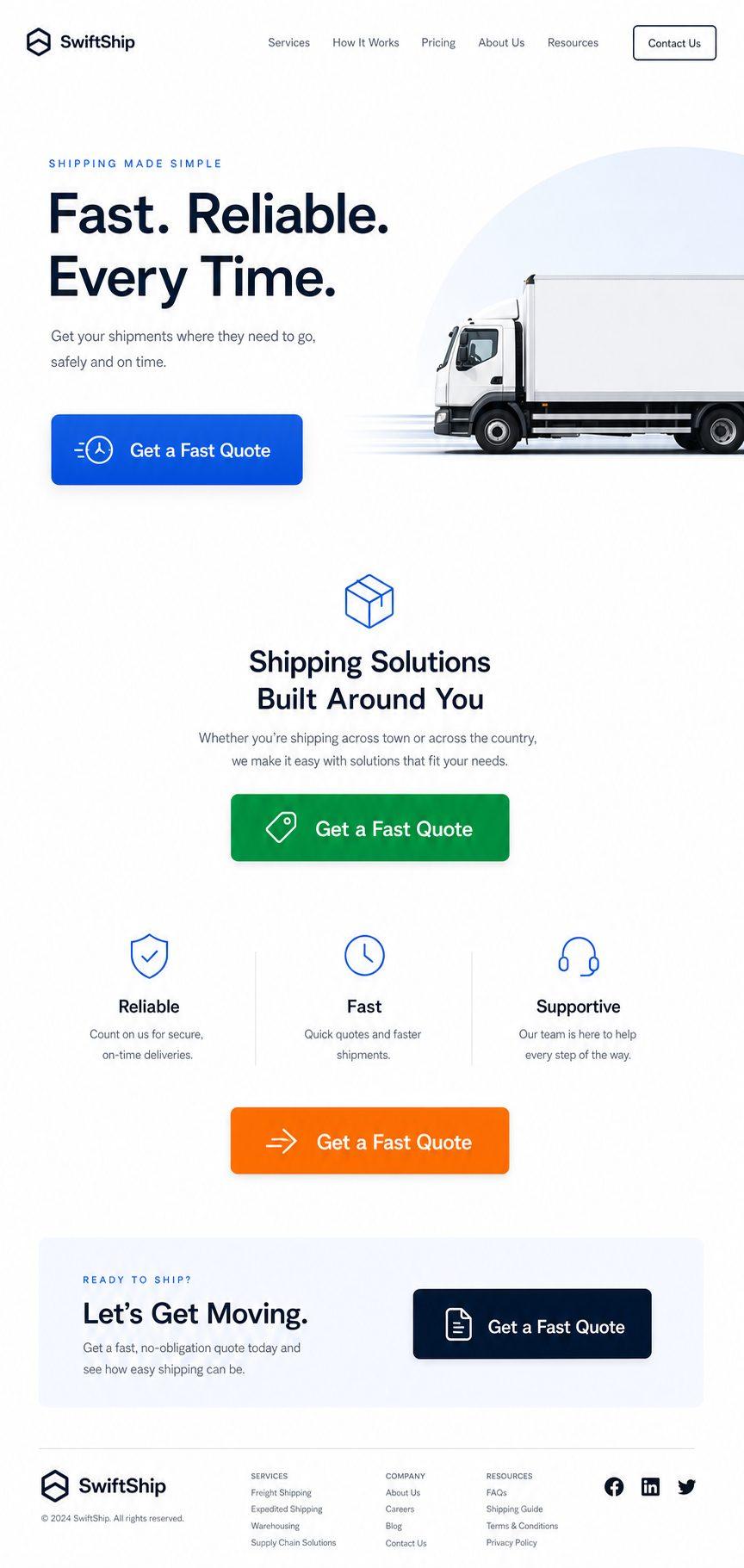
- Top right of your navigation — visible the instant the page loads, on every page of your site
- In the hero section — directly below your main headline, above the scroll line
- Mid-page — after you’ve shared proof, reviews, or your service summary
- Footer — catch anyone who scrolled to the bottom without acting
This isn’t cluttering the page with buttons. These are four natural stopping points where a motivated visitor is ready to act. Meet them there.
Make It Impossible to Miss
Your CTA button should be a contrasting color — something that stands out visually from the rest of your page, not something that blends into the background. Bold. Clear. Readable.
Think of your website as a well-lit runway. The CTA buttons are the lights guiding the plane in. You want them visible, consistent, and pointing in one direction.
A Quick Audit for Your Current Website
Open your homepage right now and ask these questions:
- How many different CTA phrases appear on this page?
- Do any of the buttons use different wording for essentially the same action?
- Is there a clear button visible without scrolling?
- Does every button match in wording and color?
- Is it immediately obvious what someone should do if they’re ready to hire you?
If you’re counting more than one primary CTA phrase or you answered “no” to the last question, there’s work to do — and the good news is it’s relatively quick work.
Quick Takeaways
- Multiple CTAs create decision fatigue and reduce overall conversions.
- Choose one primary action and commit to it fully.
- Use the exact same CTA phrase on every button across your entire website.
- Place CTA buttons in four key spots: navigation, hero section, mid-page, and footer.
- Make your CTA button a contrasting, bold color that’s visually impossible to miss.
FAQ
Why does having multiple CTAs hurt conversions?
When visitors encounter several different calls to action, they have to decide which one is right for them. That micro-decision introduces hesitation. For many people, the easiest resolution to hesitation is to do nothing — they leave without acting. One clear CTA removes that hesitation entirely.
What if I want to offer multiple contact options, like phone and email?
You can offer multiple contact methods while still having one primary CTA. For example, your main button can say “Get a Fast Quote” and link to a short contact form, while your phone number sits visibly in the header as a secondary option. The key is that the primary action is clear and dominant — everything else is supplementary.
How do I choose between “Call Now” and “Get a Free Quote”?
Think about how your customers prefer to engage and how your business sells best. If most of your customers call to ask questions before committing, “Call Now” removes the middleman. If customers often want a number before calling, “Get a Free Quote” gives them a low-risk first step. Either works — what matters most is picking one and using it consistently.
Does button color actually matter that much?
Yes. A button that blends into the page background won’t draw attention. A high-contrast color — one that stands out clearly from your site’s color scheme — signals that this is the action to take. It doesn’t need to be loud or garish; it just needs to be visually distinct.
Want Someone to Audit Your CTA Path?
Sometimes it takes a fresh set of eyes to spot what’s quietly costing you leads. At Medic 1 Media, we work with local businesses to make sure every part of their website is working toward one goal: getting the phone to ring and the forms to fill. We offer a free website audit where we walk through your current CTA setup and show you exactly what to change. No sales pressure. Just honest, useful feedback from people who work on local service websites every day.
Get My Free Growth Audit