Websites & Conversion
Microcopy: The Tiny Text That Gets You More Calls
Small reassuring phrases near your forms and buttons can dramatically increase conversions. Here’s how microcopy works and how to use it for your local business.
·5 min read
You’ve done everything right. Your website looks clean. Your services are listed. You’ve got a contact form.
And people are still not filling it out.
Sound familiar? There’s a good chance the problem isn’t the form itself. It’s what — or what isn’t — sitting right beside it.
Those few short words surrounding your call to action? That’s microcopy. And for a lot of local business websites, it’s the difference between a visitor who hesitates and a visitor who hits submit.
What Is Microcopy?
Microcopy is the small supporting text that appears near your forms, buttons, and calls to action. It’s not your headline. It’s not your service description. It’s the quiet reassurance that shows up exactly where doubt lives.
Things like: - Under a contact form button: “We’ll get back to you within 24 hours.” - Next to a phone number: “Call now — quick questions welcome.” - Under a pricing section: “No hidden fees. Ever.” - Below a form field asking for an email: “We don’t share or sell your information.” - Near a free consultation offer: “No obligation — just a conversation.”
Short. Specific. Placed exactly where hesitation strikes.
Why Hesitation Is Where Conversions Die
Think about the last time you almost did something online — almost signed up, almost called, almost filled out a form — and then didn’t.
What stopped you?
Usually it wasn’t a big logical objection. It was a small nagging doubt. “What if they spam me?” “What if this is going to turn into a high-pressure sales call?” “What if the quote they give me is way more than I can afford?” “What if they don’t respond for a week?”
These micro-doubts happen in a fraction of a second, just before someone clicks. And most websites do absolutely nothing to address them.
That’s the gap microcopy fills. It doesn’t change your offer. It doesn’t redesign your page. It just places a small, honest, reassuring answer right at the moment someone almost talked themselves out of taking action.
The Classic Principle Behind It
The copywriters who built the direct mail industry understood this intuitively. The legendary advertising principle they embodied — minimize doubt, maximize certainty — is just as relevant on a website today as it was in print a century ago.
The idea is simple: every extra “cost” attached to a response (effort, risk, uncertainty, time) reduces the likelihood that someone will take that response. Your job is to lower that cost as much as possible.
Microcopy is one of the most efficient ways to do that. A few words in the right place can remove a doubt that would have cost you a call.
Microcopy in Action: Real Examples for Local Businesses
Here’s how this plays out for the kinds of service businesses common in your community.
Under the Contact Form Button
Without microcopy: Just a button that says “Submit.”
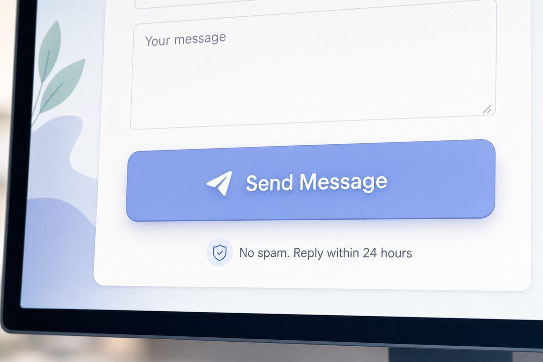
With microcopy: Button that says “Send My Request” + text beneath: “We reply within one business day. No spam, ever.”
The second version answers two common hesitations at once: “Will they actually respond?” and “Am I going to get on a list?” Both are legitimate concerns. Both now have answers. Trust goes up. Submissions go up.
Next to the Phone Number
Without microcopy: Just a clickable phone number.
With microcopy: Phone number + “Call now — we answer quickly and keep it pressure-free.”
If someone was on the fence about calling because they dreaded a high-pressure sales experience, that one line removes the objection. The phone number becomes less intimidating.
Under a Pricing Section
Without microcopy: Service pricing or “Contact us for a quote.”
With microcopy: “No surprise charges. We walk through every cost upfront before any work begins.”
For service businesses especially, hidden fees and unexpected invoices are a top fear. Name that fear and address it head-on.
Near a Free Offer
Without microcopy: “Schedule a Free Consultation.”
With microcopy: “Schedule a Free Consultation — no commitment required, just a quick conversation to see if we’re a good fit.”
That addition transforms a potentially anxiety-inducing action into something that feels safe and low-stakes.
Where to Place It (and Where Not To)
Microcopy works because it shows up at the decision point — not before, not after. So placement matters.
Good placements: - Directly below form buttons - Next to phone numbers and email addresses - Under pricing or quote sections - Beside free offer CTAs - Next to fields asking for personal information (email, phone)
Where it doesn’t help: - In the middle of long paragraphs — it gets lost - At the top of the page before context has been established - Overused throughout the page — it loses its power
A little goes a long way. Two or three well-placed lines of microcopy can do more than a full paragraph of reassurance further up the page.
Quick Takeaways
- Microcopy is the small supporting text near forms, buttons, and CTAs that removes last-second doubt.
- Hesitation — not confusion — is often where conversions die; microcopy addresses hesitation directly.
- The most effective microcopy is specific, honest, and placed exactly where doubt strikes.
- Common doubts to address: spam, pressure sales tactics, hidden fees, response time, commitment.
- Less is more — two to three well-placed lines beat a wall of reassurance text.
FAQ
What is microcopy on a website?
Microcopy is short, supporting text placed near calls to action — form buttons, phone numbers, pricing sections — that reduces hesitation by addressing common doubts. It’s the small phrases that say “this is safe, easy, and worth your time” right when a visitor is deciding whether to act.
Does microcopy really increase form submissions?
Yes. When visitors hesitate at a form, it’s usually because of a small unanswered concern — “will they spam me?” or “will they call me 10 times?” A few honest, specific words that answer those concerns directly can meaningfully increase the number of people who follow through.
How long should microcopy be?
As short as possible while still being specific. A single line is ideal. “No spam. We reply within 24 hours.” is more powerful than two paragraphs explaining your privacy policy. Brevity and specificity are the keys.
Where is the most important place to put microcopy?
Directly under your primary call to action button — whether that’s a form submission button, a scheduling link, or a phone number. That’s the exact moment the decision is being made, and it’s where reassurance does its best work.
Want to Add Conversion-Focused Microcopy to Your Site?
If your forms are getting views but not submissions — or if your phone number is visible but not ringing — microcopy might be exactly what’s missing. At Medic 1 Media in your area, we audit the full conversion path on your website and add the kind of strategic, honest copy that helps visitors say yes. Small changes in the right places add up to a measurable difference in calls, form fills, and real leads. Start with a free website audit and we’ll identify where hesitation is costing you.
Get My Free Growth Audit