Websites & Conversion
Your Homepage Is Not a Brochure — A Local Business Guide
A brochure informs. A homepage should convert. Learn the structure local businesses use to turn website visitors into paying customers.
·5 min read
There’s a version of a business website that exists mostly to exist. It has your logo, a few paragraphs about your history, a list of services, maybe some stock photos. It looks professional enough. And it generates almost no leads.
That’s a brochure. And brochures are terrible at getting the phone to ring.
A homepage that actually works isn’t an information dump — it’s a guided conversation. It walks a visitor from “I just found this business” to “I’m ready to call” in a clear, logical sequence. The difference between those two approaches is the difference between a website that sits there and a website that sells.
Why Brochure Sites Convert Poorly
A printed brochure is passive. You hand it to someone, they flip through it at their own pace, and whether they call is entirely up to them. There’s no guidance, no urgency, no clear next step built in.
Most small business websites work the same way — and they get the same results.
The legendary advertising mind David Ogilvy understood that the ultimate job of any piece of communication is to make the reader take action. A homepage that only informs without guiding people toward a decision is leaving money on the table. Every visit that ends without a call or a form submission is a lead that walked in the front door and left without buying.
The fix isn’t necessarily a full redesign. It’s a structure shift.
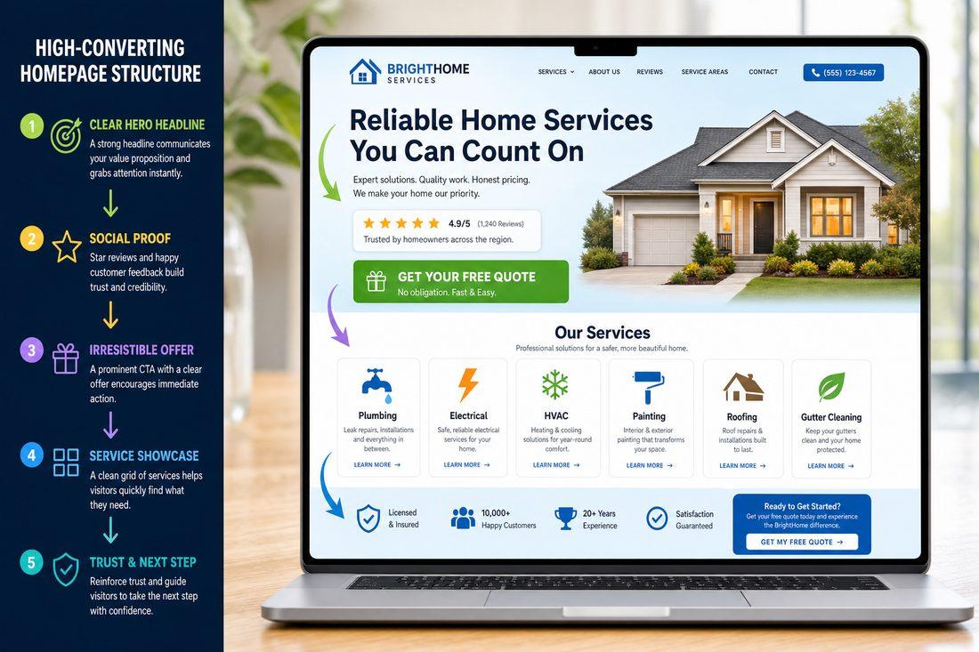
What a High-Converting Homepage Looks Like
Think of your homepage as a sales conversation that happens without you in the room. It needs to do the same job a great salesperson does: establish relevance, build trust, handle objections, and make it easy to say yes.
Here’s a structure that works for local service businesses in your community and beyond:
1. Headline — Service + Location + Outcome
The first thing a visitor reads should immediately communicate three things: what you do, where you do it, and what outcome they can expect. Not your company name. Not a tagline. The direct answer to “can you help me?”
Example: “Expert Plumbing in your area, FL — Same-Day Service, Upfront Pricing”
That headline does a lot of work in very few words.
2. Proof — Reviews, Credentials, and Experience
People don’t call strangers. They call businesses that feel trustworthy. Put your proof close to the top of the page — before someone has to scroll far to find it. This includes:
- Star ratings and review counts from Google or other platforms
- Years in business or years serving your local area
- Logos of associations, licenses, or certifications relevant to your industry
- Before/after results or specific outcomes if applicable
Proof near your CTA is especially powerful. People are more willing to act when reassurance is right there next to the button.
3. Offer — A Clear, Low-Friction Next Step
What can someone get just for reaching out? A free estimate. A free consult. A free website audit. An offer turns your CTA from “contact us” into “get something valuable.” It lowers the perceived risk of reaching out, which means more people actually do it.
Make the offer specific. “Free consultation” is fine. “Free 30-minute marketing review for local businesses” is better.
4. Services — 3 to 6 Clear Tiles
Not a paragraph listing everything you’ve ever done. A clean grid of your core services, each with a brief description and its own link. Three to six options. Any more than that and you start creating the same overwhelm problem that makes people leave.
5. FAQ — Answer the Questions Holding People Back
Most visitors have the same handful of concerns: How much does it cost? How quickly can you help me? Do you serve my area? What happens after I fill out the form? Put those answers on the homepage. The more questions you answer before someone picks up the phone, the warmer that call will be when it comes.
6. Repeat the CTA — Same Words, Every Time
Use the exact same call-to-action phrase every time it appears on the page. Not “Call Now” in one place and “Get Started” in another and “Request a Quote” somewhere else. Pick one phrase and repeat it. Consistency reduces confusion and makes the action feel familiar by the time someone reaches the bottom of the page.
The Test That Reveals Everything
Here’s a simple way to check whether your current homepage works like a brochure or works like a sales tool:
Ask someone who has never seen your business before to look at your homepage for ten seconds. Then ask them:
- What does this company do?
- Where do they serve?
- What should you do if you want to hire them?
If they can’t answer all three clearly, you’ve found your problem. That’s exactly what’s causing visitors to leave without calling.
Quick Takeaways
- A brochure informs. A homepage should guide visitors toward a specific action.
- High-converting homepages follow a clear structure: headline, proof, offer, services, FAQ, repeated CTA.
- Proof close to your CTA increases the likelihood visitors will act.
- Use the same CTA wording throughout the entire page — consistency builds momentum.
- Test your homepage with a fresh set of eyes: can they answer the three key questions in ten seconds?
FAQ
How is a homepage different from a brochure website?
A brochure website presents information for visitors to passively read. A high-converting homepage is structured to actively guide visitors toward a specific action — calling, submitting a form, or booking a consult. The difference is in the intent behind the design and copy, not just the visual appearance.
How much proof do I need on my homepage?
More is generally better, as long as it’s relevant and real. A handful of strong reviews, your years of experience, and any credentials or certifications are a strong start. You don’t need to overwhelm the page — just enough to make a first-time visitor feel confident they’re not taking a risk by reaching out.
Should I list all my services on the homepage?
Keep it to your three to six most important or most searched services. Each should link to a dedicated service page with more detail. Listing everything on the homepage creates visual clutter and dilutes focus. Let the homepage introduce your core offerings; let individual service pages do the heavy lifting.
How often should I update my homepage?
Review your homepage at least twice a year. At minimum, make sure reviews are current, any seasonal offers are accurate, and your contact information is correct. Fresh, accurate content also signals credibility to both visitors and search engines.
Let’s Look at What Your Homepage Is Actually Doing
If your site has been live for a while but calls and form fills feel lower than they should be, the structure of your homepage is worth a hard look. Medic 1 Media works with local service businesses in your community to build homepages that guide visitors toward action — not just inform them. We offer a free website audit where we review your current setup and show you exactly where the conversion gaps are. No pressure. No obligation. Just an honest look at what your homepage is and what it could be doing for your business.
Get My Free Growth Audit