
Websites & Conversion
Why Your Contact Form Isn’t Getting Filled Out (Local Business Fixes)
Long contact forms kill conversions. Learn how local small businesses can simplify their forms and get more leads with less friction.
·4 min read
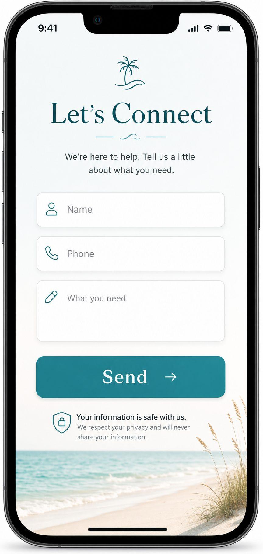
You’ve got a contact form on your website. That’s good. But if it’s not getting filled out — or if you’re getting far fewer submissions than you’d expect — there’s a reason.
And it’s probably not that people don’t want to contact you.
It’s that the form is asking too much.
The Mortgage Application Problem
Think about the last time you started filling out an online form and gave up halfway through. Too many fields. Too many required answers. Things you didn’t feel comfortable sharing before you’d even spoken to someone.
Now think about your own contact form. Does it ask for:
- Full name
- Email address
- Phone number
- Address
- Best time to call
- Service needed
- Budget range
- How did you hear about us
- Additional details
That’s not a contact form. That’s a job application.
When you make it hard to reach out, people don’t reach out. They move on to the next business — the one that just asks for a name and a phone number.
What Actually Works
The highest-converting contact forms are short. Brutally short.
Here’s what you really need:
- Name — so you can address them like a person
- Phone number or email — one way to get back to them
- What they need — one brief field, a sentence or two
That’s it. Everything else — their address, their timeline, their budget — you can get on the phone. The goal of the form is to get the conversation started, not to pre-qualify them before you’ve said hello.
The classic principle in direct-response marketing has always been this: reduce the cost of response. The easier it is to take the next step, the more people will take it. Make the form feel effortless and you’ll get more submissions from the exact people you want to hear from.
The Power of the Micro-Promise
Here’s a small tweak that makes a bigger difference than most people realize.
Add a single line of reassuring text directly under your submit button. Something like:
- “We reply within 1 business day.”
- “No spam. No pressure. Just a quick conversation.”
- “We’ll reach out within 24 hours — no obligation.”
This is called microcopy, and it does something important: it removes the hesitation that lives in the split second before someone clicks submit.
Most people pause at that moment. They think: What happens next? Will I get spammed? Will someone call me 10 times? A single line of honest reassurance dissolves that hesitation and gets you the submission.
Mobile Forms Are a Special Case
Here’s something worth paying attention to: the majority of people finding your business in your area are doing it on their phones.
A form that looks fine on a desktop can be a nightmare on mobile. Small fields that are hard to tap. Keyboard that pops up and covers the submit button. Text that wraps awkwardly. Required fields that are easy to miss.
If your form isn’t tested and optimized for mobile, you’re losing leads from the exact device your customers are using most.
A few things to check on mobile: - Are the input fields large enough to tap easily? - Does the keyboard cover the submit button? - Is the form short enough to complete in under a minute? - Does it look clean and trustworthy, or cluttered and confusing?
A Simple Before/After
Before (too much friction): > Name, Email, Phone, Address, Service Type, Preferred Contact Time, Budget Range, How Did You Hear About Us, Additional Notes
After (optimized for conversions): > Name, Phone or Email, What can we help you with? > “We’ll get back to you within 1 business day — no pressure.”
Same business. Same visitors. More submissions.
Quick Takeaways
- Long forms kill conversions — most people bail when a form feels like too much work
- The ideal form has 3 fields: name, contact info, and a brief note about what they need
- Add a micro-promise under the submit button to dissolve last-second hesitation
- Always test your form on a real phone — mobile usability matters enormously
- The goal is to start a conversation, not gather all the information upfront
FAQ: Contact Forms for local Small Businesses
How many fields should my contact form have?
Three is the sweet spot for most local service businesses. Name, one contact method (phone or email), and a short field for what they need. You can always collect more information once you’re on the phone with them.
Should I require both a phone number and an email address?
Make one or the other required, not both. Some people prefer a call; others prefer email. Giving them the choice reduces friction and increases the number of people who complete the form.
Does the text under the submit button really matter?
More than you’d think. That line of microcopy — “No spam. We’ll reply within 24 hours.” — addresses the exact hesitation people feel before hitting submit. It’s a small addition with a real impact on conversions.
What if I need more information before I can give a quote?
That’s what the phone call is for. The form’s only job is to get someone to raise their hand. Once they’ve done that, you can ask everything you need during the follow-up conversation.
Let’s Fix Your Contact Flow
If your form is long, complicated, or untested on mobile — it’s costing you leads right now. The good news is this is one of the easiest fixes in the world of website optimization. At Medic 1 Media, we help local businesses redesign their contact flow so more visitors turn into actual calls and form submissions. We look at your form, your microcopy, your mobile experience, and your follow-up process — and we tell you exactly what to change. It starts with a free website audit. No long forms, we promise.
Get My Free Growth Audit