Websites & Conversion
Why a Confusing Website Kills Calls for Local Businesses
Confused visitors don’t call. Learn how local small businesses can rewrite their homepage for clarity, reduce bounce, and turn visitors into leads.
·5 min read
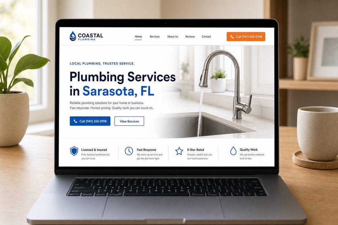
Here’s something most business owners never consider: your website probably isn’t losing leads because it looks bad. It’s losing them because it’s confusing.
Visitors land on your homepage with one simple question in mind — “Can this person help me?” If they have to dig around to figure out what you do, who you serve, or what to do next, they don’t stick around to find out. They bounce. And that bounce just cost you a potential customer.
The good news? Clarity is fixable — and fixing it can change how your phone rings.
The #1 Reason People Don’t Call
Confusion.
Not ugly design. Not the wrong color palette. Confusion.
When someone finds your website in your area, they’re usually in decision mode. They’ve got a problem, they want a solution, and they have roughly five seconds of patience before they move on to the next result. If your homepage makes them work to understand what you do, you’ve already lost them.
The legendary copywriter Claude Hopkins built his career on one principle: reduce friction, increase response. That idea is just as relevant to your website today as it was in the print-ad era. Every extra click, every vague phrase, every missing piece of information is friction. And friction kills calls.
What Confusing Homepages Have in Common
Most confusing websites share the same problems. See if any of these sound familiar:
- A vague headline — “Welcome to Our Website” or “Serving the Community Since 2005” tells a visitor almost nothing useful.
- No clear service statement — Visitors shouldn’t have to read three paragraphs to understand what you do.
- No defined service area — If you’re a roofer in your area, say so at the top. People want to know you’re nearby.
- Buried contact information — Your phone number and call-to-action button should be impossible to miss, not hidden in the footer.
- Too many choices — When everything is emphasized, nothing is. Too many options create paralysis.
Any one of these is enough to make a visitor leave. Stack two or three together and you’re practically pushing people out the door.
What a Clear Homepage Does Instead
A clear homepage answers three questions instantly — before the visitor has to scroll:
- What do you do? (“Landscaping & lawn care services”)
- Who is it for / where? (“For homeowners in your area, FL”)
- What should I do next? (“Call now for a fast, free quote”)
That’s it. Three answers, front and center. Everything else on the page supports those three things.
Replace Vague Headlines with Specific Ones
Compare these two headlines:
- “Welcome to Our Website” (tells a visitor nothing)
- “Landscaping in your area, FL — Fast Quotes, Friendly Service” (tells a visitor everything)
The second one immediately answers who you are, what you do, and where you operate. That one change alone can reduce bounce rate and increase the number of people who keep reading.
Add a Single, Clear Promise
What can someone expect when they reach out to you? Give them a one-line promise near the top of the page. Something like:
- “Same-day replies, guaranteed”
- “Upfront pricing — no surprises”
- “Free estimates within 24 hours”
This isn’t about being flashy. It’s about removing hesitation. When a visitor knows what to expect, they’re more likely to take the next step.
Place Your CTA Where People Actually Look
Your call-to-action button — “Call Now,” “Get a Free Quote,” whatever your primary action is — needs to live in two spots minimum:
- Top right of the navigation bar (visible the moment the page loads)
- Mid-page (after you’ve given them a reason to act)
Don’t make someone hunt for how to contact you. The easier you make it, the more people follow through.
A Quick Checklist: Is Your Homepage Clear?
Run through these in 30 seconds:
- Does your headline say what you do AND where you do it?
- Can a stranger tell your service area within five seconds?
- Is there one clear next step (not three or four options)?
- Is your phone number clickable and visible without scrolling?
- Is there at least one specific promise near the top of the page?
If you answered “no” to two or more, there’s friction on your homepage — and that friction is costing you calls right now.
Quick Takeaways
- Confusion, not ugly design, is the top reason visitors don’t contact local businesses.
- Your homepage must answer three things immediately: what you do, who it’s for, and what to do next.
- Specific headlines beat generic ones every time.
- A single clear promise near the top reduces hesitation.
- CTA buttons belong at the top and mid-page — not just the footer.
FAQ
Why does a vague homepage headline hurt conversions?
A vague headline forces visitors to work harder to understand your business. When someone lands on your site, they make a fast judgment about relevance. If your headline doesn’t clearly state what you do and where, many visitors will assume you’re not the right fit and move on — even if you’re exactly what they need.
How long do I have to make a good impression on a new visitor?
Research consistently shows website visitors form an impression in just a few seconds. That’s not much time to communicate value. Your headline, subheadline, and primary CTA need to do the heavy lifting immediately — before the visitor decides whether to scroll.
What’s the best call-to-action for a local service business in your area?
The best CTA is specific and low-commitment. Instead of a generic “Contact Us,” try “Get a Free Quote,” “Call for a Fast Estimate,” or “Schedule a Free Consult.” Pick one, use the exact same wording everywhere on the page, and make it visually impossible to miss.
Do I need a full website redesign to fix these clarity issues?
Not necessarily. Many of the highest-impact changes — rewriting the headline, adding a clear promise, repositioning a CTA button — don’t require a full rebuild. Sometimes a focused tune-up on your homepage copy and structure is enough to see a real difference in calls and form fills.
Ready to See What’s Holding Your Site Back?
If you’ve read this far and you’re wondering what your homepage actually looks like to a first-time visitor, that’s worth finding out. At Medic 1 Media, we work with local businesses in your community to make websites that actually generate calls — not just look nice. We offer a free website audit where we walk through your site, point out exactly where the friction is, and show you what to fix first. No pressure, no sales pitch. Just honest feedback you can use.
Get My Free Growth Audit