Websites & Conversion
Your Competitor Isn’t Better — Their Website Is Clearer
Wondering how your competitor keeps getting calls when you offer the same or better service? The answer is usually website clarity. Here’s the fix for local businesses.
·6 min read
You’ve probably thought it at least once.
“How is that company getting all those calls? I’ve been in this industry longer. My work is better. I know this area like the back of my hand. Why are they getting leads that should be mine?”
Here’s an honest answer: sometimes a competitor isn’t winning because they’re more skilled, more experienced, or even cheaper. They’re winning because their website answers the visitor’s questions faster.
That’s it. Clarity is beating you — and clarity is one of the most fixable things on the internet.
The Simple Truth About How People Choose Online
When someone in your area searches for a local service business — a tree service, a landscaper, an accountant, a contractor — they’re usually opening multiple tabs. They’re doing a quick comparison round. And in that comparison, they’re not doing deep research. They’re scanning.
They’re not reading your entire service description. They’re not analyzing your credentials line by line. They’re doing a fast mental checklist that happens almost unconsciously:
- What does this company do? (Is it what I’m looking for?)
- Are they in my area? (your area, your county — near me?)
- Do they seem trustworthy? (Reviews? Real photos? Looks professional?)
- What do I do next? (Is there an obvious button or phone number?)
If any of those questions takes more than a second or two to answer — or worse, if it doesn’t get answered at all — they close the tab and try the next result.
Your competitor might have won that particular race not because they had better service, but because their homepage gave faster answers.
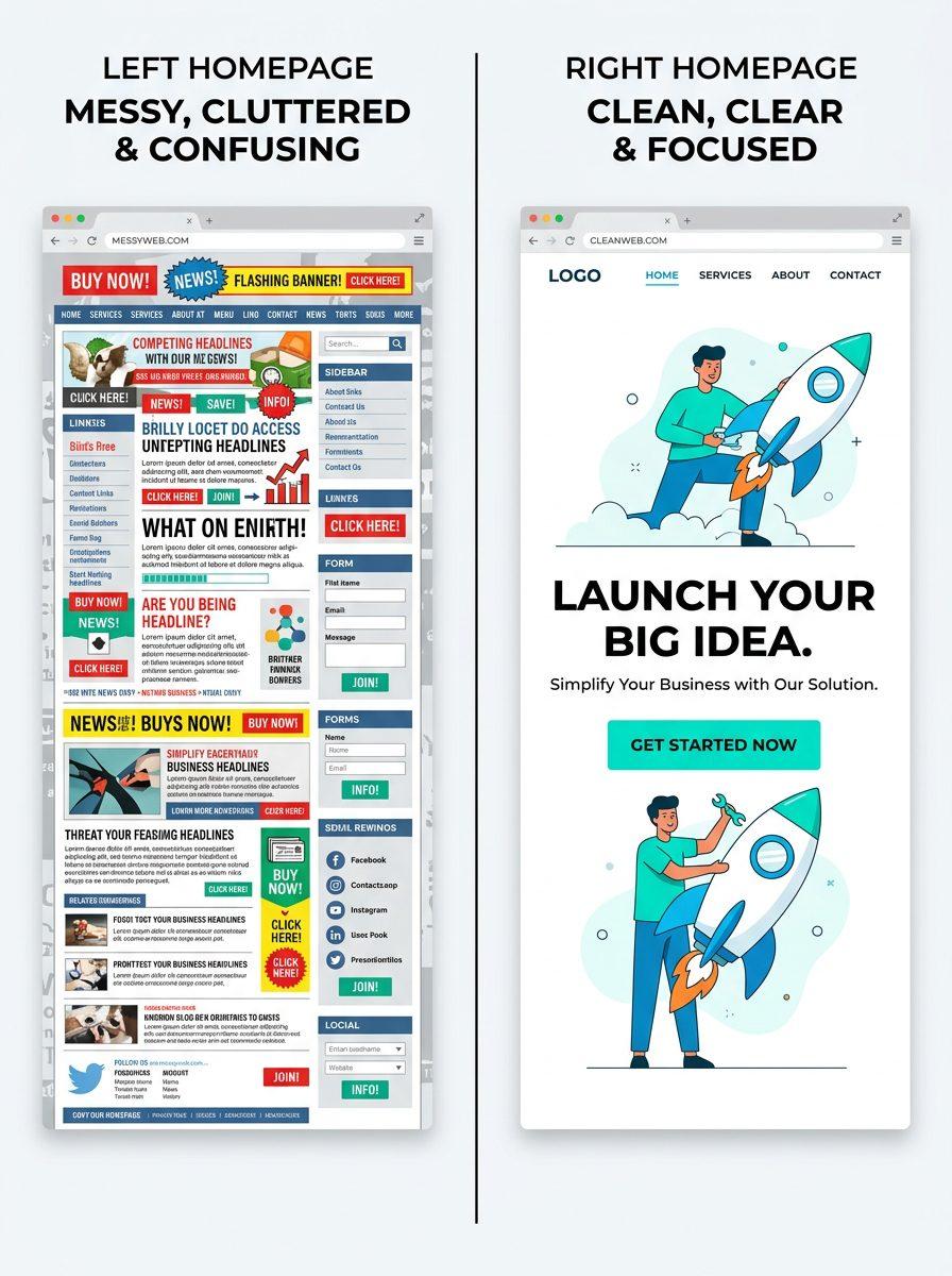
The Anatomy of a Clear Website Homepage
If you want to stop losing leads to competitors who aren’t even better than you, here’s what clarity actually looks like in practice.
A Big, Specific Headline
The first thing a visitor reads when they land on your homepage should answer question one and two immediately: what you do, and where you do it.
Vague (bad): “Quality Services for Your Home”
Clear (good): “Expert Tree Removal in your area, FL — Same-Week Service Available”
The second version tells the right visitor in a heartbeat: “Yes, this is for me.” The first one makes them work to figure out if it’s relevant.
Your headline is not the place to be clever or poetic. It’s the place to be instantly, unmistakably clear.
Your Service Area in Plain Sight
This is a small detail that local businesses often overlook, and it costs leads consistently. If your site doesn’t prominently display that you serve your local area — or your county more broadly — visitors can’t be sure you’ll actually show up.
Don’t make someone dig through your Contact page to find out if you service their zip code. Put it in the headline, in the first paragraph, or in a simple line near the top of the page. “Proudly serving your local community, Flagler Beach, Bunnell, and surrounding areas” — done.
One Strong, Visible CTA
A clear website has one dominant action it wants the visitor to take — and it makes that action obvious.
One button. A consistent color. Prominent placement above the fold. Same button text every time it appears on the page.
If someone has to look around to figure out how to contact you, the competitor who made it a one-click experience wins by default.
Proof Where It Counts
Trust is earned quickly or not at all. Three to five Google reviews displayed near the top of your page, a count of years in business, a few real photos of completed work — these are proof signals that tell the scanner “this company is real and people like them.”
Put proof close to your CTA. The moment someone is deciding whether to call you, they should be surrounded by reasons to feel confident about that decision.
The 10-Second Clarity Test
Want to know if your website is winning or losing the clarity race right now?
Try this: ask a friend, family member, or neighbor who doesn’t know your business well to look at your homepage for exactly 10 seconds. Then close the laptop and ask them three questions:
- What does this company do?
- Where are they located or what area do they serve?
- What would you do if you wanted to contact them or get a quote?
If they can’t answer all three quickly and confidently — you found the leak. That’s the gap between you and the competitor getting your calls.
This test is brutally honest because it replicates exactly how real visitors experience your site: quickly, without reading deeply, looking for fast answers.
Clarity Is a Skill, Not a Given
Here’s the thing about website clarity — it’s deceptively hard to achieve on your own website. You know your business intimately, so what feels obvious to you is often opaque to someone coming in cold.
That’s why even experienced, established businesses in your area sometimes have confusing homepages. Not because they don’t know what they do — but because they’re too close to it to see what a visitor doesn’t understand.
Fresh eyes matter. And a structured approach to clarity — specific headline, service area, proof, single CTA — makes all the difference.
Quick Takeaways
- Competitors often win leads not because they’re better, but because their website answers questions faster.
- Visitors scan and make fast decisions — your site needs to pass the 10-second test.
- Your headline should say exactly what you do and where, without requiring interpretation.
- Display your service area clearly and prominently — don’t make visitors guess.
- One strong CTA, positioned clearly, removes friction at the moment of decision.
- Proof (reviews, photos, years in business) near the CTA builds confidence at exactly the right moment.
FAQ
How do I know if my website is unclear?
Run the 10-second test described above: show your homepage to someone unfamiliar with your business for 10 seconds, close it, and ask them what you do, where you operate, and what to do next. Hesitation or wrong answers reveal the clarity gap.
What should my homepage headline say?
Lead with your primary service, your location, and ideally a benefit or differentiator. “Reliable Landscaping in your area, FL — Free Estimates” is more effective than anything clever or abstract. Clarity and specificity outperform creativity in local business headlines.
Does my service area really need to be on the homepage?
Yes — especially for local businesses. Visitors decide in seconds whether you’re relevant to them. If your your local area service area isn’t immediately visible, nearby visitors may assume you don’t serve their location and click away. Make it easy to confirm you’re local.
What if I have multiple services — how do I keep the homepage clear?
Lead with your most common or highest-value service in the headline, then list your full range below. A grid of service tiles lower on the page works well for showing breadth without cluttering the above-the-fold experience. Keep the top of the page focused on one clear offer.
Ready to Build a Website That Wins on Clarity?
If you’ve been watching competitors get calls that should be yours, the good news is: clarity is one of the fastest and most cost-effective things to fix. At Medic 1 Media in your area, we build and optimize local business websites specifically for the way people search and decide — fast scans, quick decisions, instant answers. We know how to create “instant understanding” — the experience where someone lands on your site and knows in three seconds that you’re exactly who they’re looking for. Start with a free website audit. We’ll walk through your homepage, identify where the clarity gaps are, and show you exactly what your competitor might be doing better — so you can fix it.
Get My Free Growth Audit